Eclipse Online Store Project:
A responsive ecommerce website design case study
Introduction
Project scope | April 2020 – July 2021
Photography | Roy Manniquil, Kristin Ellis, Becca Ruvalcaba
Design and Project Lead | Becca Ruvalcaba
Backend | Dan Foley
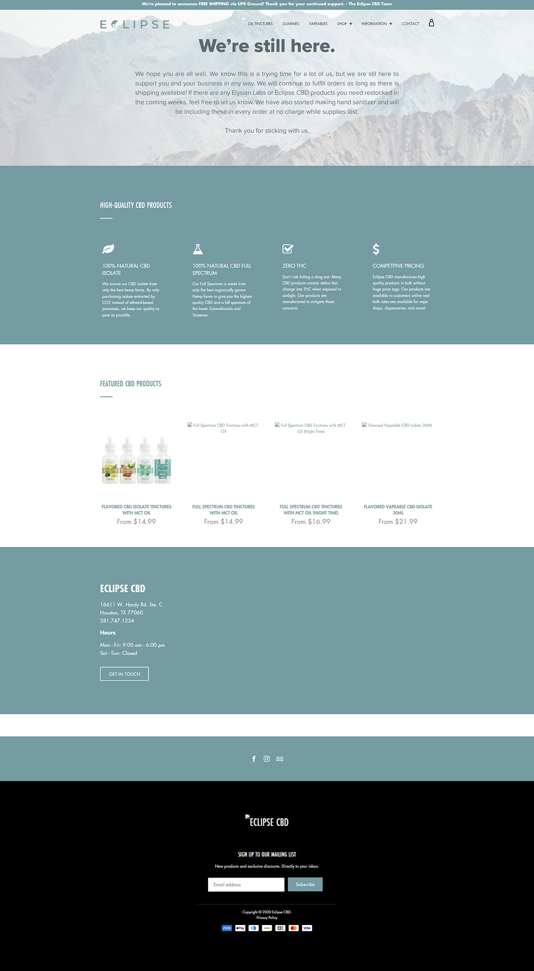
The original website only lasted a couple of months before we switched platforms and decided I would build the new version.
The Team
ProcessEvaluate and anticipate
The Problem
Building structure
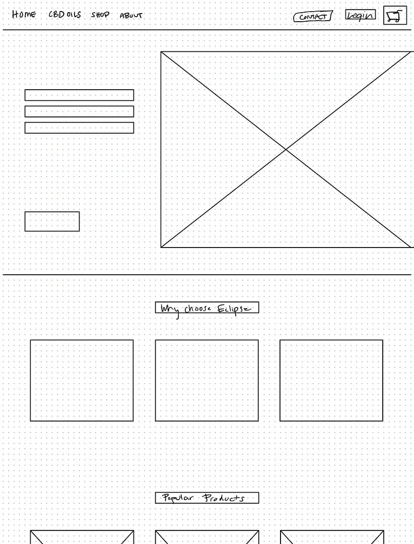
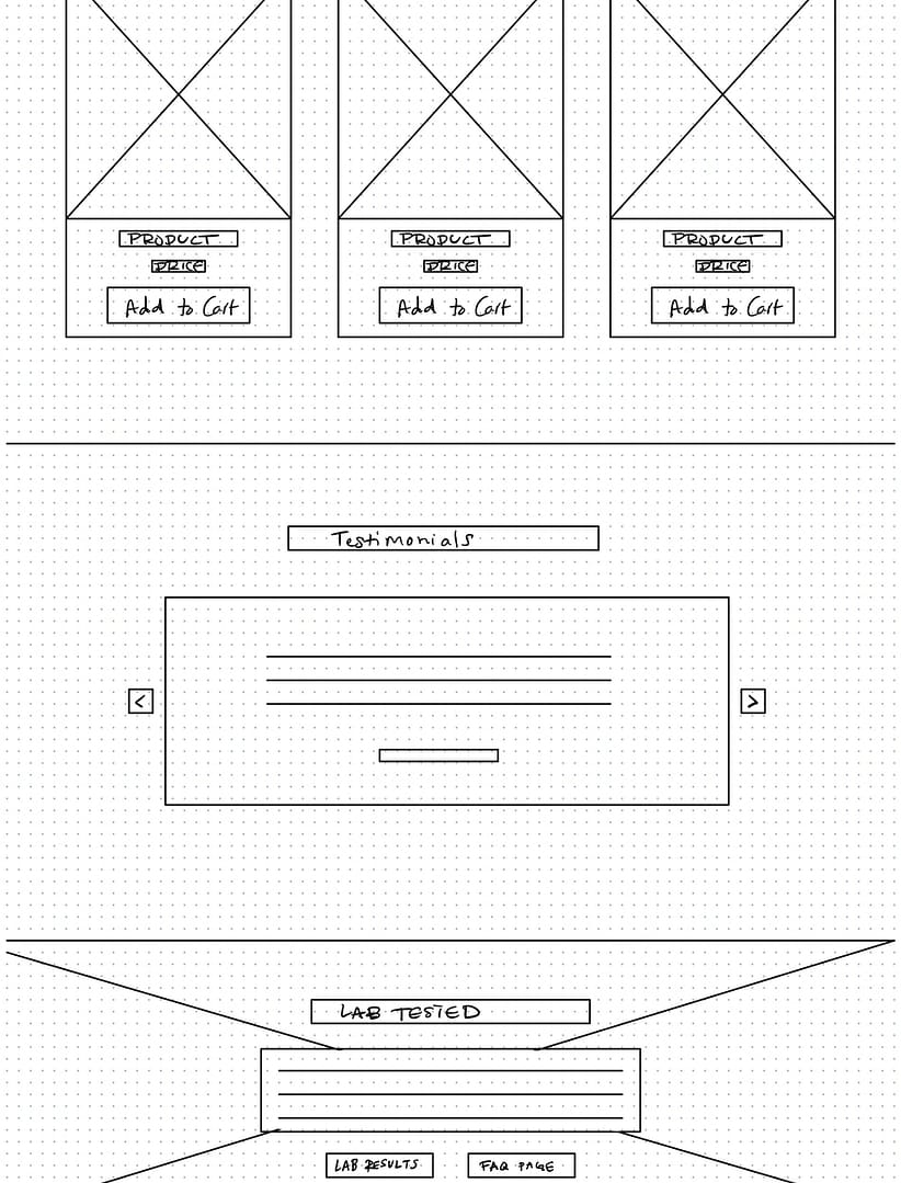
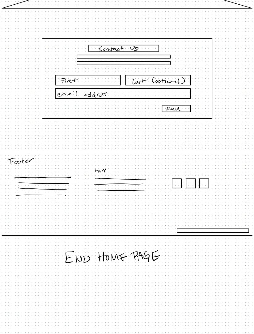
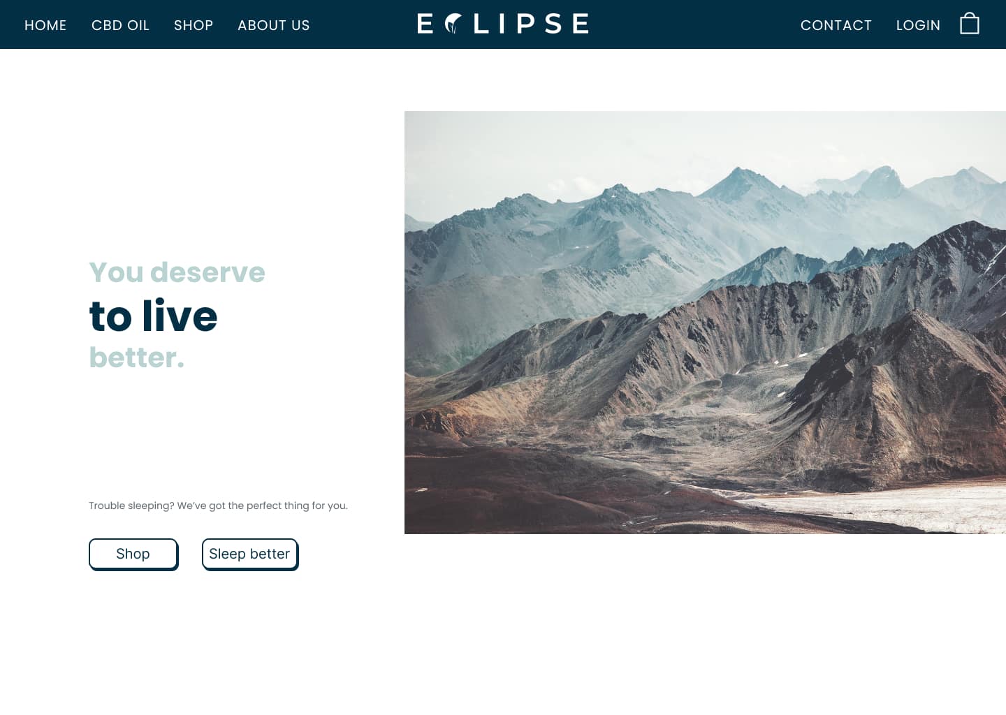
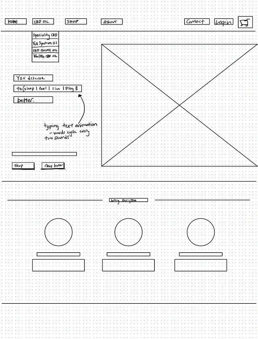
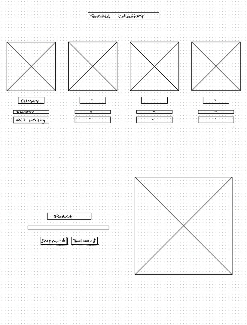
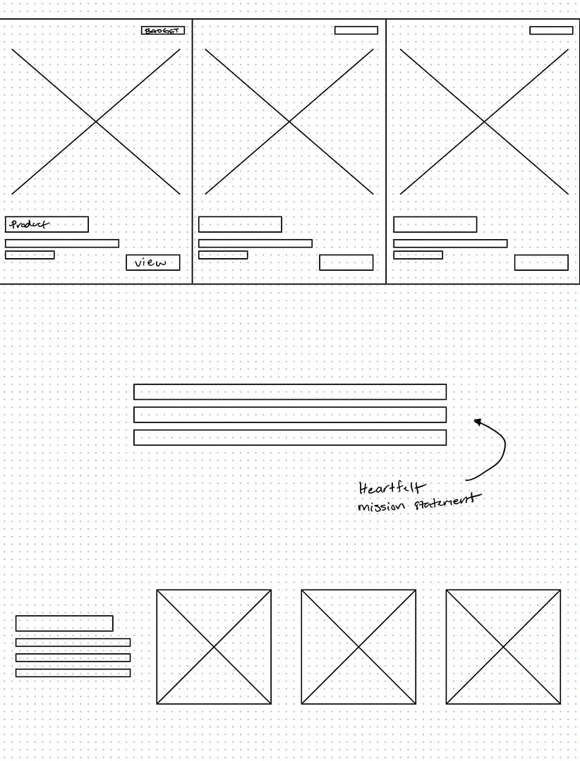
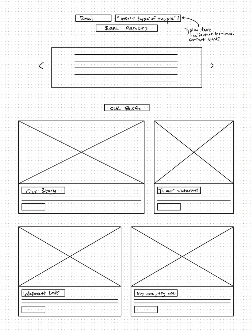
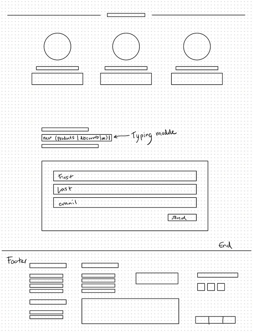
I put a lot of effort into making sure our front page had structure. I designed it to gradually build trust, going so far as putting value propositions at the beginning and end. The goal was to ease customers into the checkout pipeline by not bombarding them with a fistful of products, but instead showing social proof, individual product spotlights, and the company mission statement.
ProcessName your obstacles
Challenges
Limited Resources
Create Visual Language
Information Heirarchy
FeedbackObserve, adapt, repeat
A temporary solution
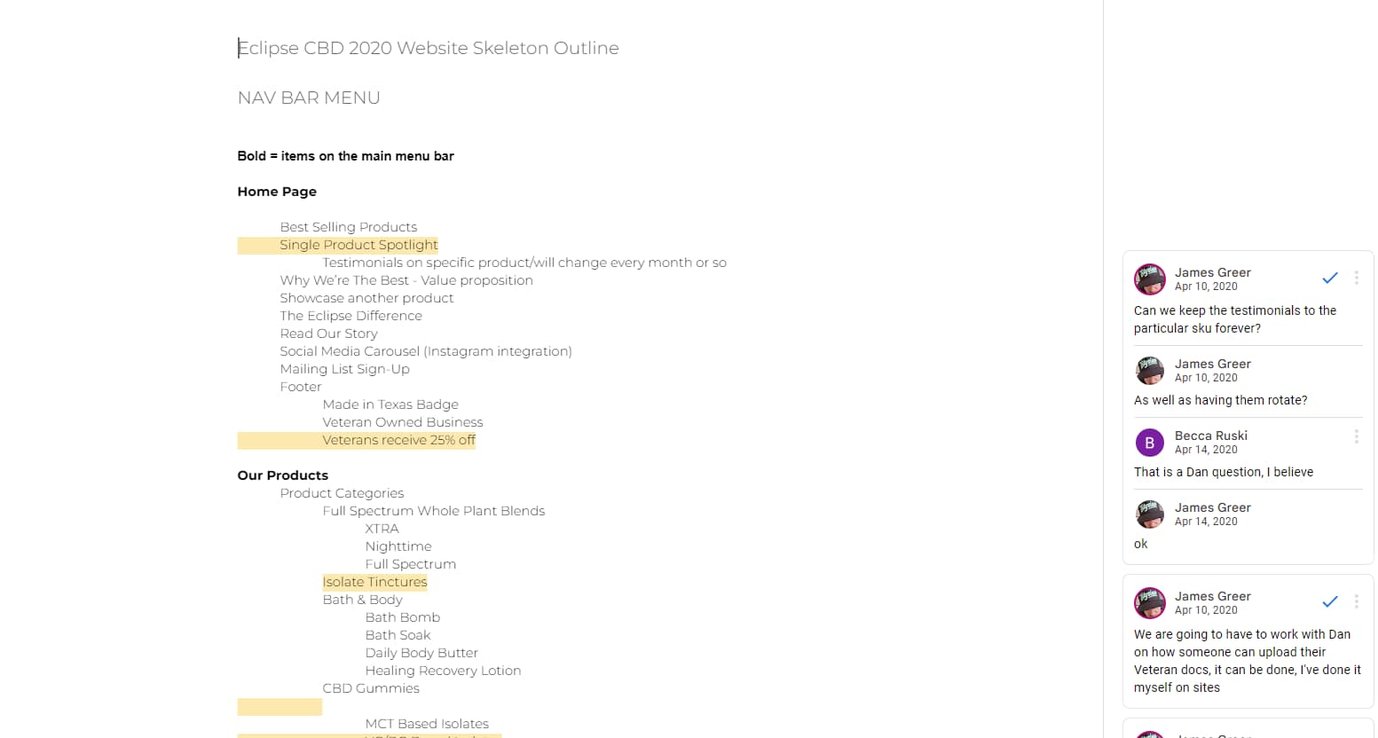
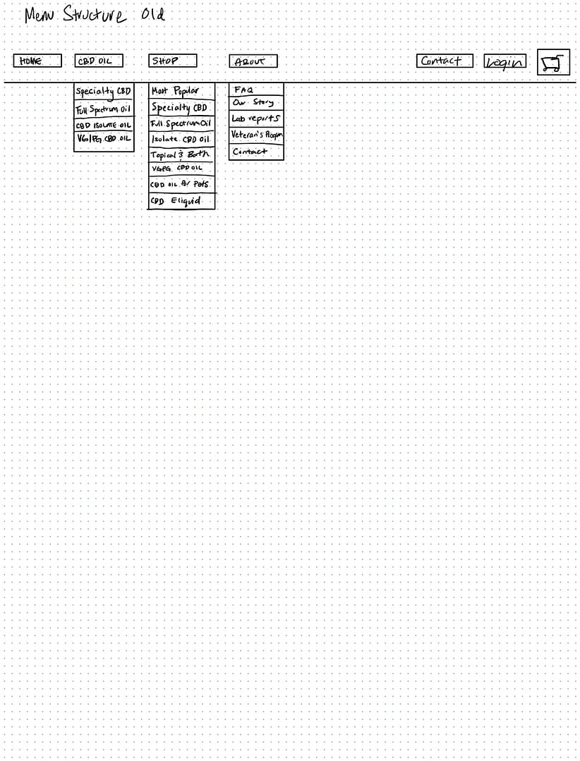
I proposed my desired changes and Dan prepared a second staging site for me to implement and test new menus and layouts. I redid the sitemap and navigation tree, focusing more on the shopping experience itself, and strengthening connections between hero sections and products.
AnalysisDiagnose the problem
Ideate potential solutions
ExecuteDeliberate problem solving
Solutions
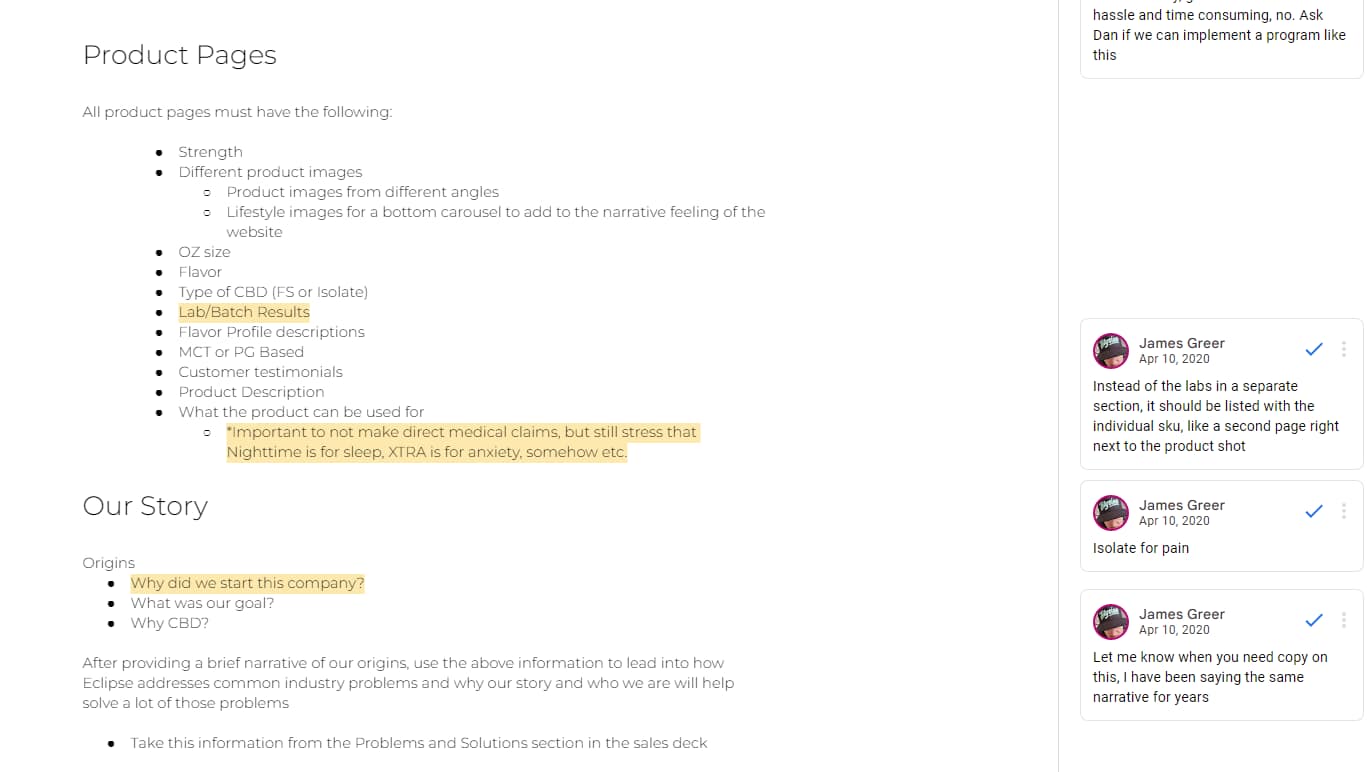
From feedback and multiple rounds of revisions, I came up with user-centered solutions. These solutions focused on user navigation and end goals, and making crucial information easy to find and read.
This video is a brief example of a typical browsing flow on Eclipse. Adding a product to the cart is simple and instant; variation swatches allow the user to flip between product variants with ease. Important elements on the product page have default and hover states to emphasize its content without demanding too much attention.
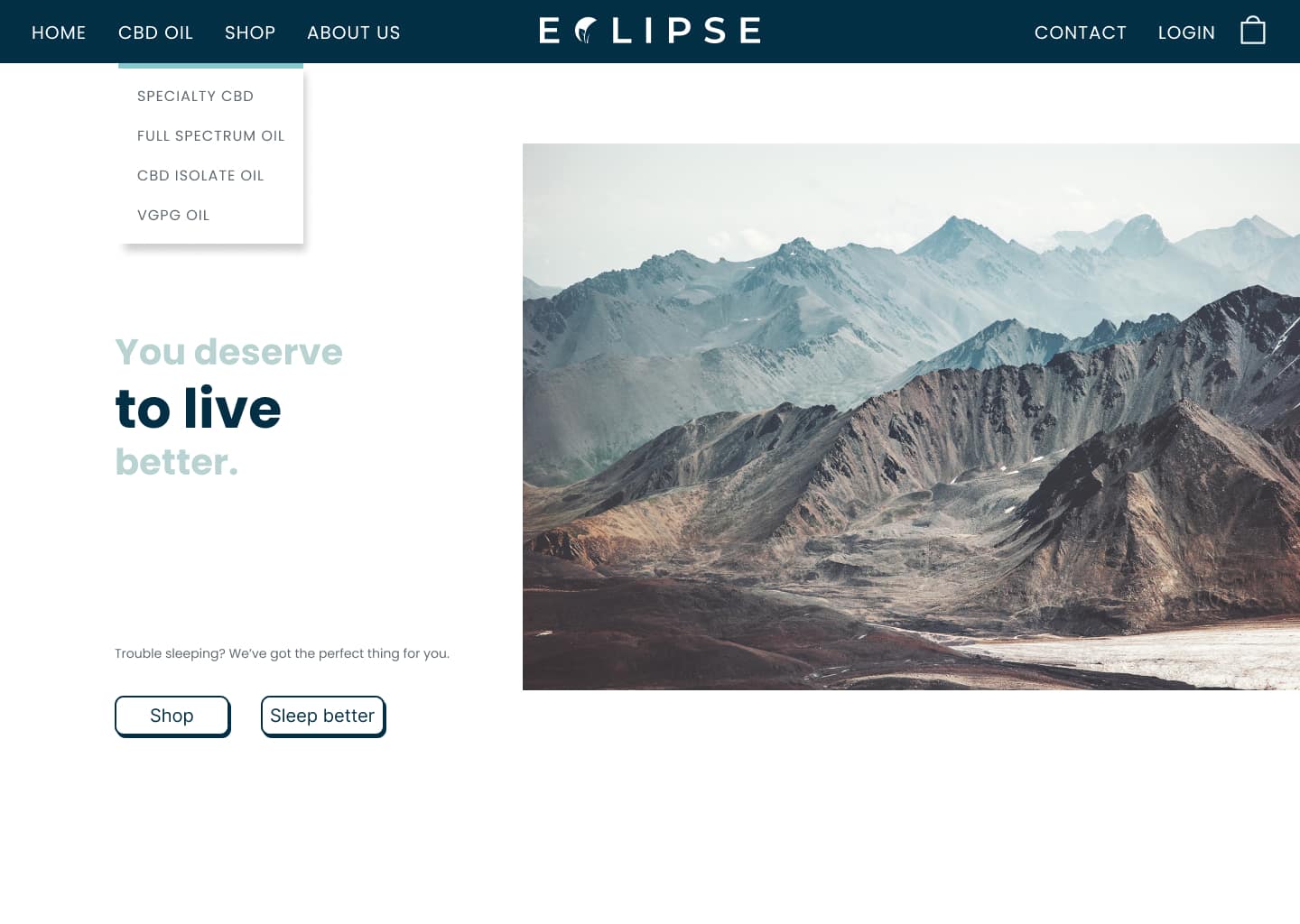
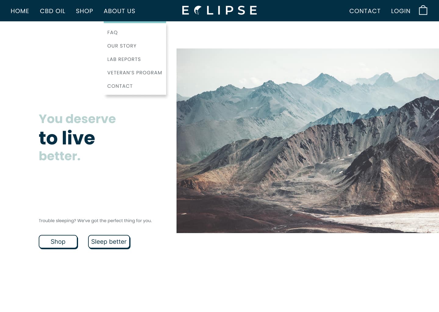
Mega menu for straightforward navigation
I solved this issue by using product categories as metaphorical street signage. Hovering over menu tabs triggers a dropdown menu with the name of individual items, like ‘Recovery Lotion’, respective to their category. Users now have clear choices: they can click the category to browse everything within that category, or they can click a specific product. Eliminating ambiguity and presenting these clear choices gives users control and turns into decision making power.
I met each one of my own criteria for our site navigation, and was immediately told that it was a game changer.
Using the home page to ease decision paralysis
We put together a list of our best-selling products and then highlighted the things that people liked most about them. I then turned each product instance on our home page into bite-sized presentations to create intrigue and bring the customer to the product page. Highlighting products in this way allowed us to help the customer by pointing them in a direction that’s already been validated by customers themselves. It allows the decision to come from a place of empathy and alleviates decision paralysis.
Product cards for grouped information
Each product card and its button animates on hover. In its hover state the product card gets a bright blue glow around it and scales up to separate itself from the others. Letting the user know exactly where they are clears any sense of confusion and keeps their focus on browsing and purchasing. It also adds a touch of reality, like when people focus on a specific object or area and the brain blurs out irrelevant information. The ‘add to cart’ grows on hover to draw attention and elicit a potential follow-up response.
Easing cognitive load on product pages
I created a custom set of icons relevant to the characteristics and benefits of our products. The icons below attract the user’s attention to make an additional product pitch using its key features as text labels.
ReflectRetrospect
Project debrief
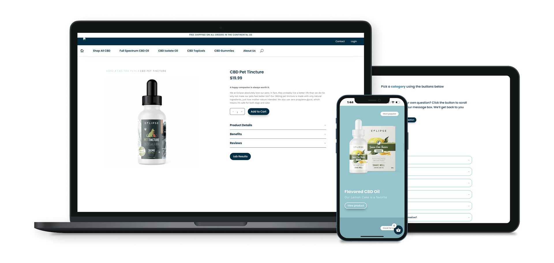
In retrospect, the first thing I would have done is put way more emphasis on the mobile side of the website. As this was my first full web project, I failed to take into account that most ecommerce traffic comes through mobile. Platforms without mobile-ready user interfaces risk alienating customers in droves. I focused on the desktop site mainly because I made a generalization: I assumed the older crowd would be more privy to seeing information on a larger screen, one more readily suitable to their visual needs, as opposed to a small mobile screen.
If I could go back and change my approach, I would pour more time into researching web traffic flows and looking into the browsing preferences of different demographics and categories of users. Using this information, I would build a framework around the group of users I’m most likely to expect to use our product. Applying these steps first would have saved me a lot of back and forth and allowed me to build out a more consistent user experience from the beginning.
