Introduction
Project scope | Summer 2018 – Fall 2020
Management | Katy Aitken, James Greer, Jim Aitken
Photography | Roy Manniquil, Kristin Ellis, Becca Ruvalcaba
Design/Copywriting | Becca Ruvalcaba
Design assistant | Dylan Patty
In 2018, Elysian Labs and its sister company, Fresh Leaf, split apart, but Fresh Leaf’s products were still in demand. The newly created Eclipse needed a brand. I had a week to produce something preliminary and usable. The new product line required packaging, labels, and manufacturing tailored to stakeholder needs. After the preliminary phase was completed, the company had some breathing room. Refining the Eclipse brand identity and aura remains one of my favorite projects.
IntroProject overview
About the project
Since Eclipse had never been commercialized and lacked customer endorsement, it had to project a sense of reliability. Even though we already had customers who would be interested in our brand regardless of how it turned out, this base alone wouldn’t produce a sufficient ROI in comparison to if we actively sought out new customers.
Our brand had to gain the trust of wholesalers and distributors, most of whom had never heard of it before. The Eclipse pricing model was competitive for the sector, so cost was never a concern. That put us slightly ahead of competing brands, but we lacked credibility. My goal was to command respect and trustworthiness through an aesthetic that was clean, simple, and beautiful.
Beginnings
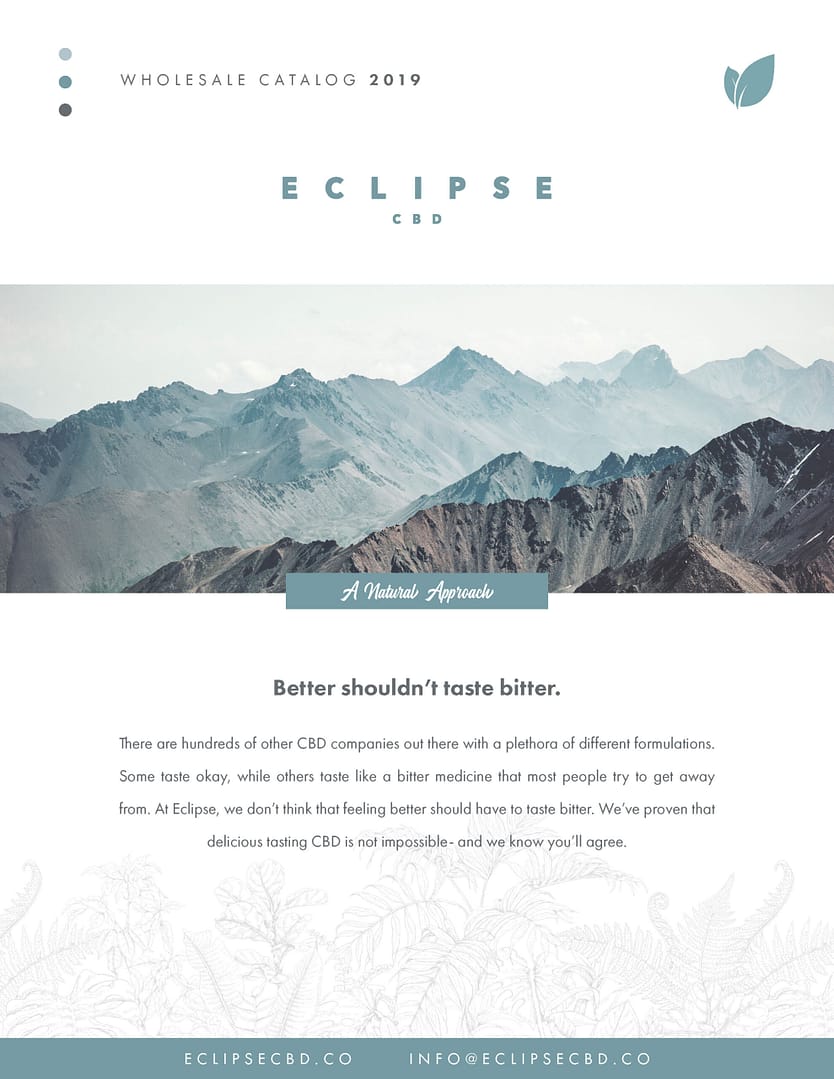
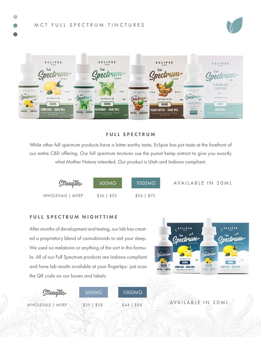
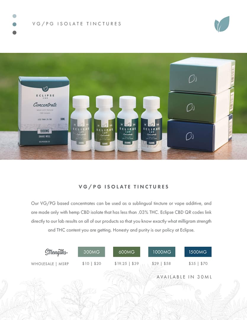
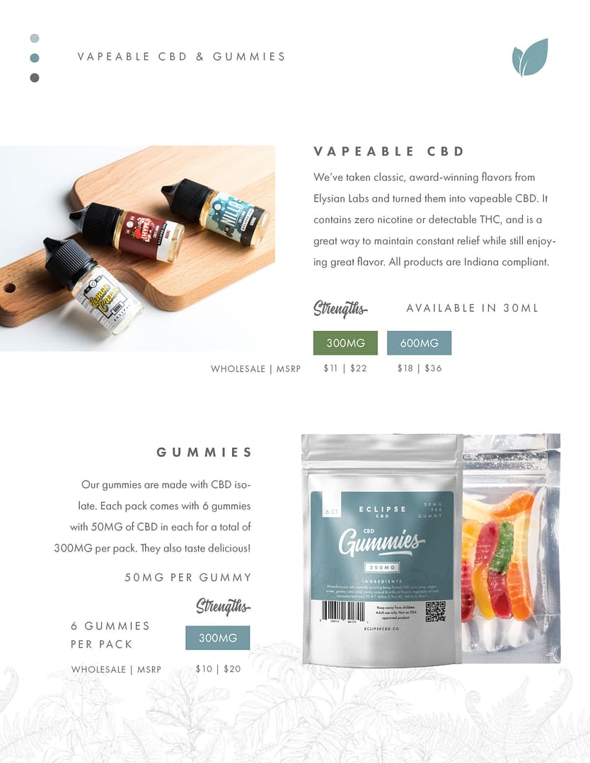
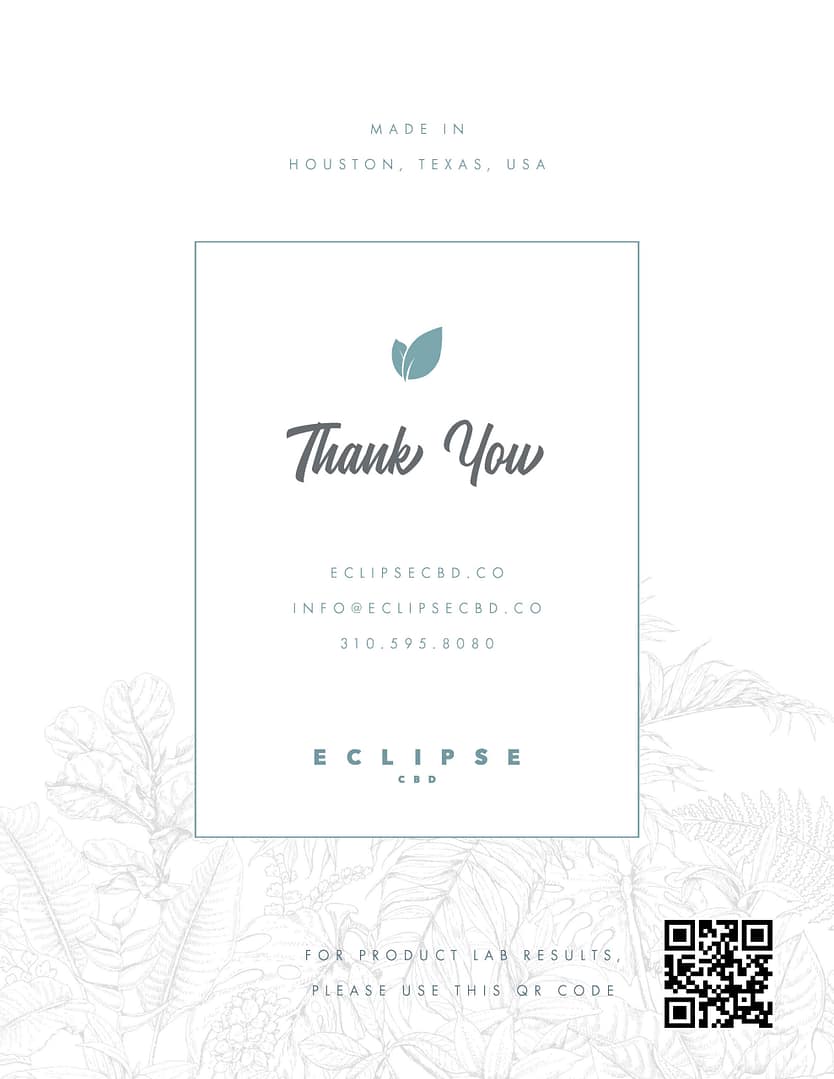
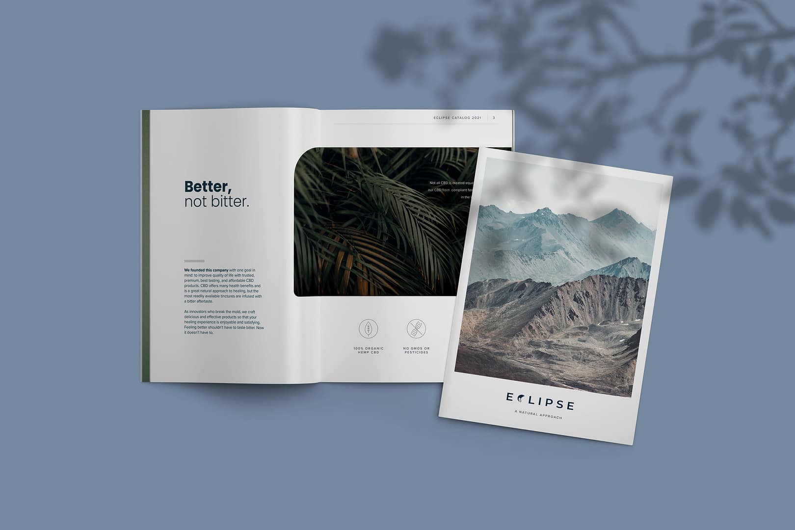
This is one iteration of the Eclipse Wholesale catalog, designed at a time when I hadn’t yet established any type of visual language or robust brand identity.
Journey – 3rd time’s the charm?
At this point in time, Eclipse had a stable identity framework, but still lacked the consistency and artistic merits found in larger companies’ identities. Still, it was progress!
IntroEstablishing roles
The Team
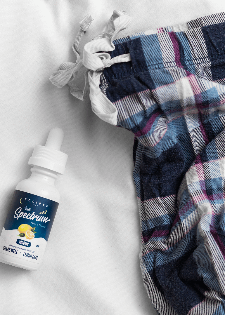
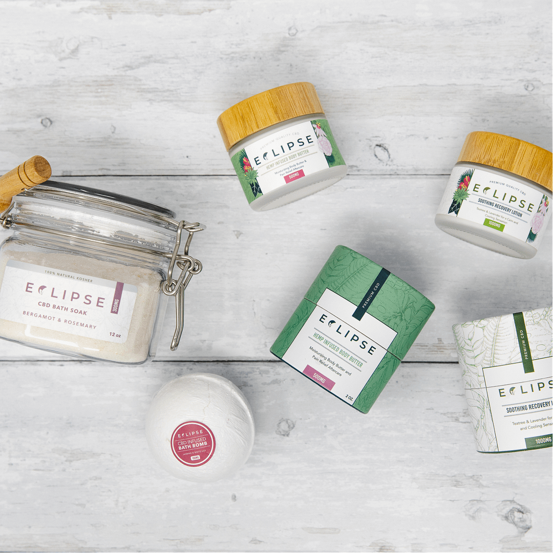
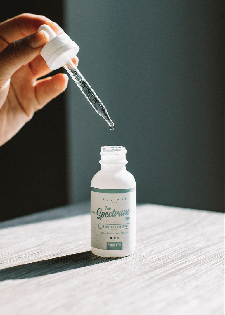
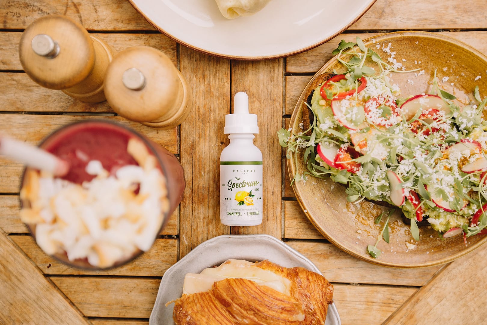
When this project was announced, I was the only designer. It was difficult to both brainstorm and pay meticulous attention to packaging details as a one-person team, since both tasks are different. I organized brainstorming sessions and feedback meetings with upper management, giving them a firsthand look at my workflow; in exchange, I discovered consumer trends in our particular sector. After the initial ramp-up period ended, I was given funding for an associate designer and hired two photographers to capture Eclipse’s serene imagery.
PreparationPinpoint desired outcomes
Challenges
The main challenge with Eclipse was developing a credible identity from scratch while simultaneously designing our product packaging. As a result, Eclipse’s first year lacked consistency due to this disruption in workflow. In addition, I began with little to no resources at a time when a full team would have been appropriate. Rather than get overwhelmed, I broke things down into smaller parts, consolidated tasks where possible, and gathered other brainpower to keep me on track.
Another challenge was that Eclipse needed to convey reliability despite never having been commercialized and lacking customer validation. In order to meet the deadline, I developed the brand framework alongside the packaging design. I gathered image references and inspiration to establish somewhat of a reference point; I wanted to plan for the future.
PreparationBuild an ideation framework
Mental workflow
Initiating my creative process requires an audit of available resources and setting up long and short-term goals. I break that down into smaller actionable goals that I can keep track of. Motivation is key with long-term projects, and setting milestone markers provides a positive reward system for rough patches. This chart best illustrates how I approached the Eclipse project with a gradual stepstone mentality.
Team DevelopmentInclusivity and open mindedness
Collaborative ideation
Inclusivity in the design process should be more than simply listening to someone give feedback. It’s calling stakeholders and teammates into the conversation, asking genuine questions on why their opinion is what it is, and listening to their justifications and musings without letting ego cloud judgement. This is the most important step in my process: it sets the tone of the project moving forward and provides direction based on consensus and dialogue. While my brainstorming framework helps me come up with ideas and concepts, it’s the dialogue in between that really chisels away at any excess and allows me the confidence i need to move forward.
Idea generation
I go through my process and make a concept. Usually this involves a lot of scribbling and doodles, with chicken scratch writing on page margins.
Ask for initial feedback
I present my initial round of ideas to stakeholders and teammates, asking each person for their thoughts and how they would handle the presented scenario.
Adjust the sails
I incorporate people’s ideas for addressing concerns and potential issues with theoretical solutions, and ask for a second round of feedback.
Move forward and repeat
At this point, I’ve consulted with multiple parties and work on presenting a polished version of the idea. Then, the cycle starts again.
DevelopDrafting themes
Conceptualize
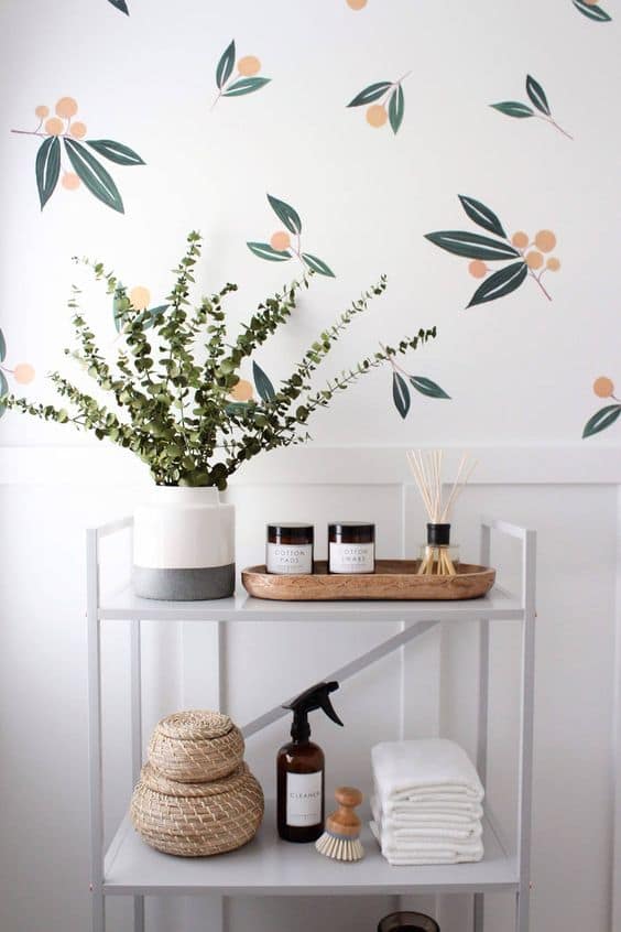
Dylan took my earlier references and built on them to create these great mood boards after we brainstormed the type of style Eclipse would grow into. They were instrumental in guiding the brand’s emotional atmospheric direction of calm, cozy, and safe. A few brands I gave Dylan as a reference were AllBirds (of course), Grovemade, and BLNCD CBD. We made informal customer personas based on existing demographic data and known traits to narrow down our thematic scope and create a reliable baseline.
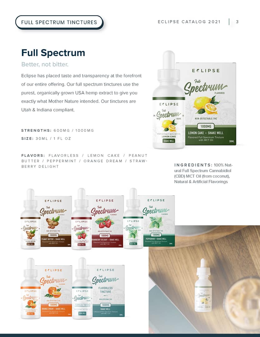
First Draft
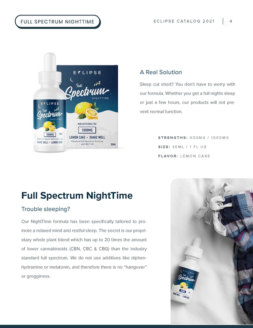
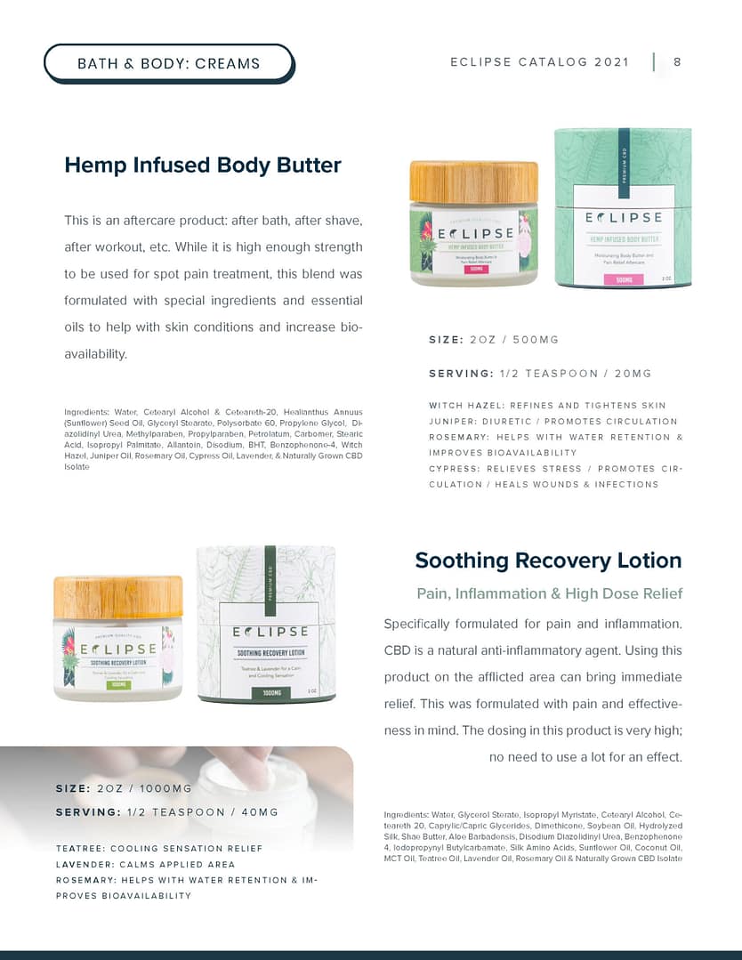
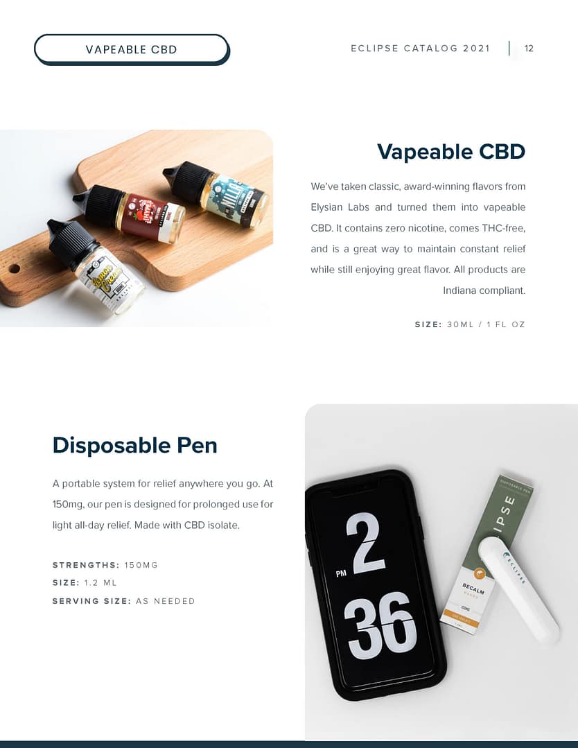
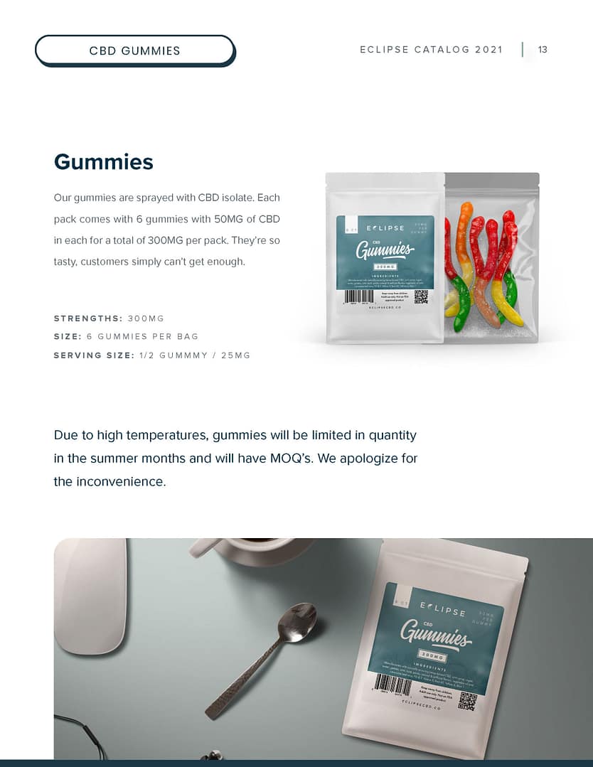
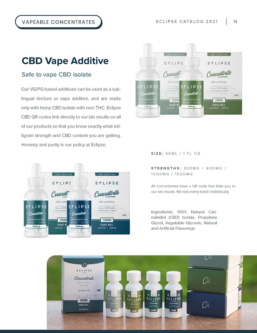
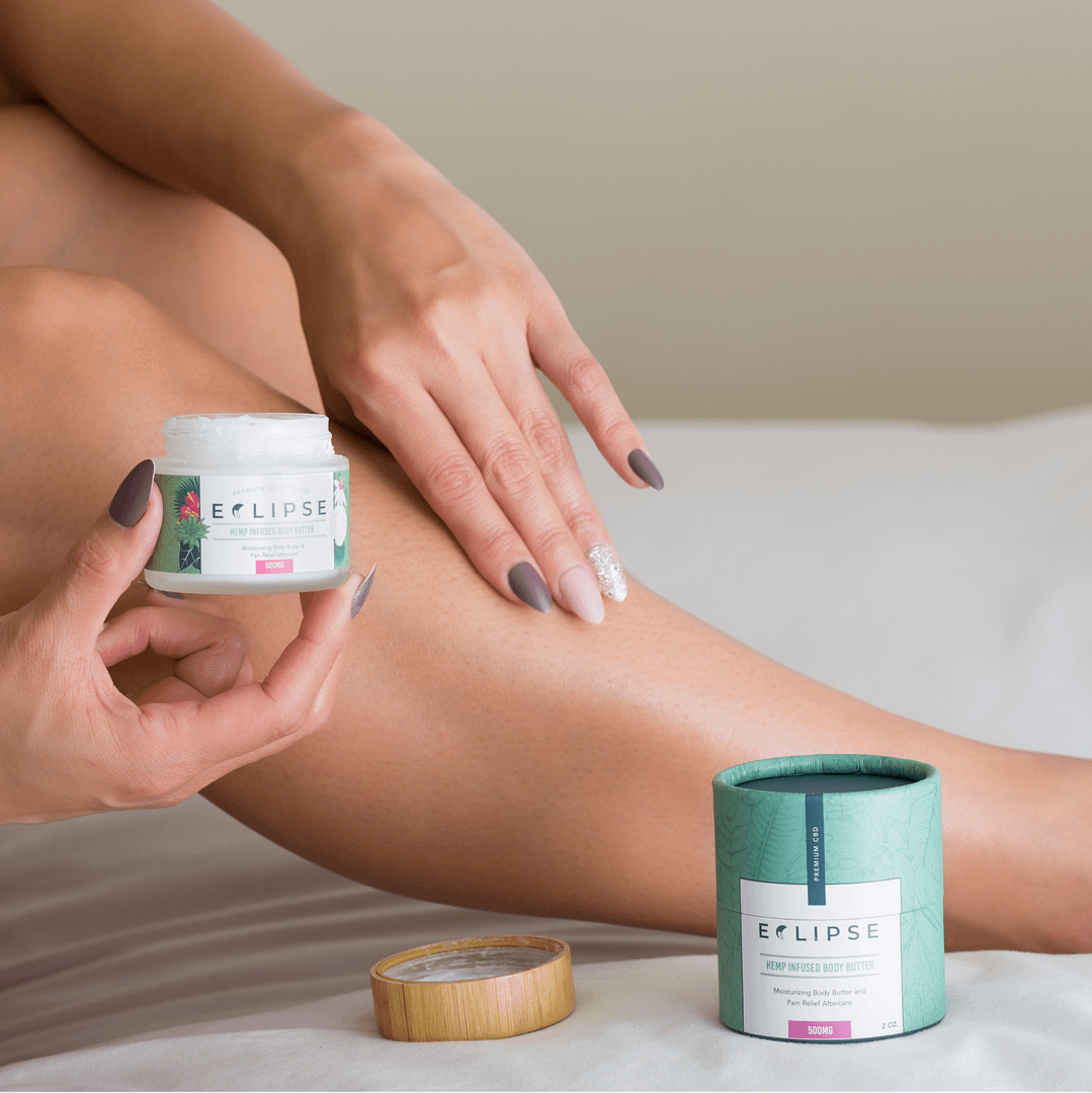
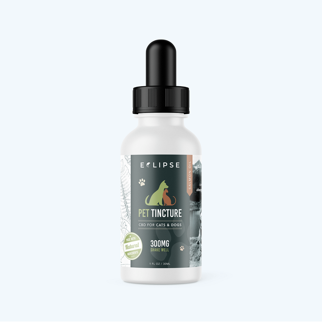
This was the first line of packaging I created for the company. Under the circumstances, it turned out fine. I would go on to refine all of these designs further down the road.
DevelopFuture-proofing and scalability
Thinking three steps ahead
I skipped several usual design steps out of circumstance, and designed our initial packaging while keeping future plans in mind. My goal was to create packaging that would command respect and trustworthiness through a clean visual aesthetic. Our base background color would be white, conveying cleanliness and safety. Our packaging would consist of muted colors in line with the Eclipse vision. While I wouldn’t normally skip ahead before I had a fleshed out framework, I had no choice and worked within my circumstances.
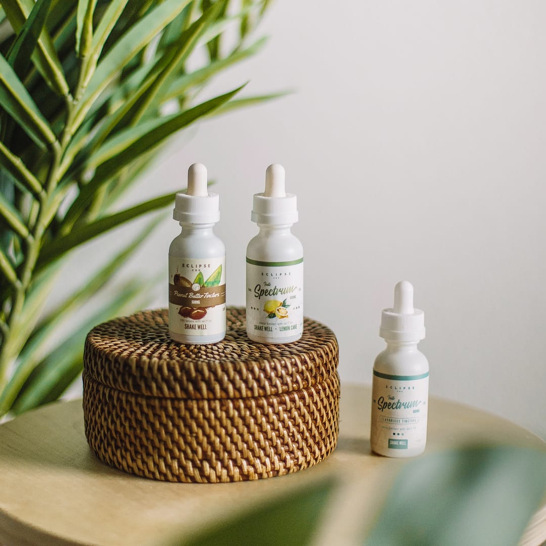
While doing all of this research, the owner of the company, Jim, ranted about how there were no good tasting options for CBD and that they all had a bitter, earthy aftertaste. Immediately, we worked out how this could be our unique angle into the market: there weren’t many good flavored products back then. We moved forward with the brand around a new slogan: better, not bitter.
Iteration analysisProgress is key
Visual evolution
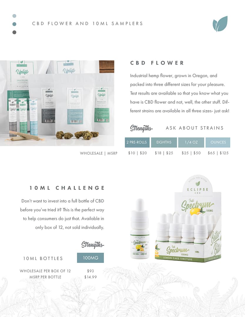
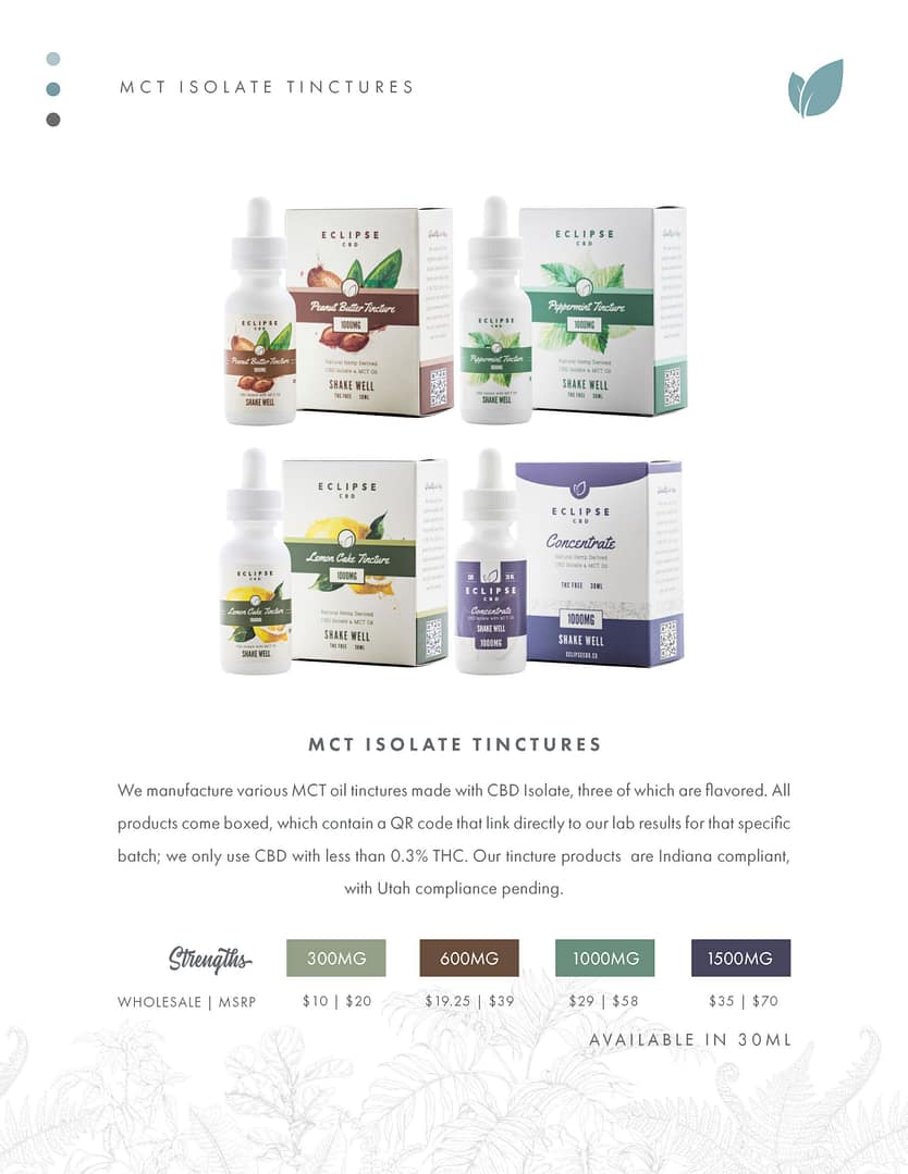
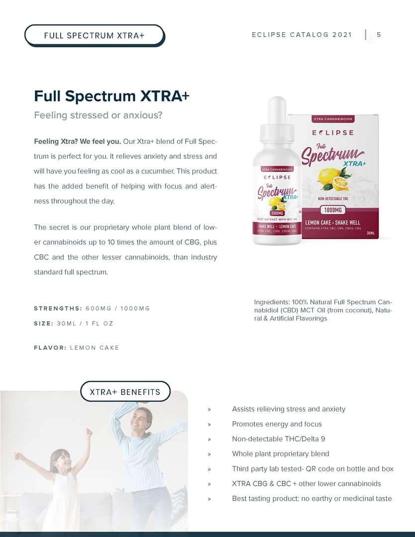
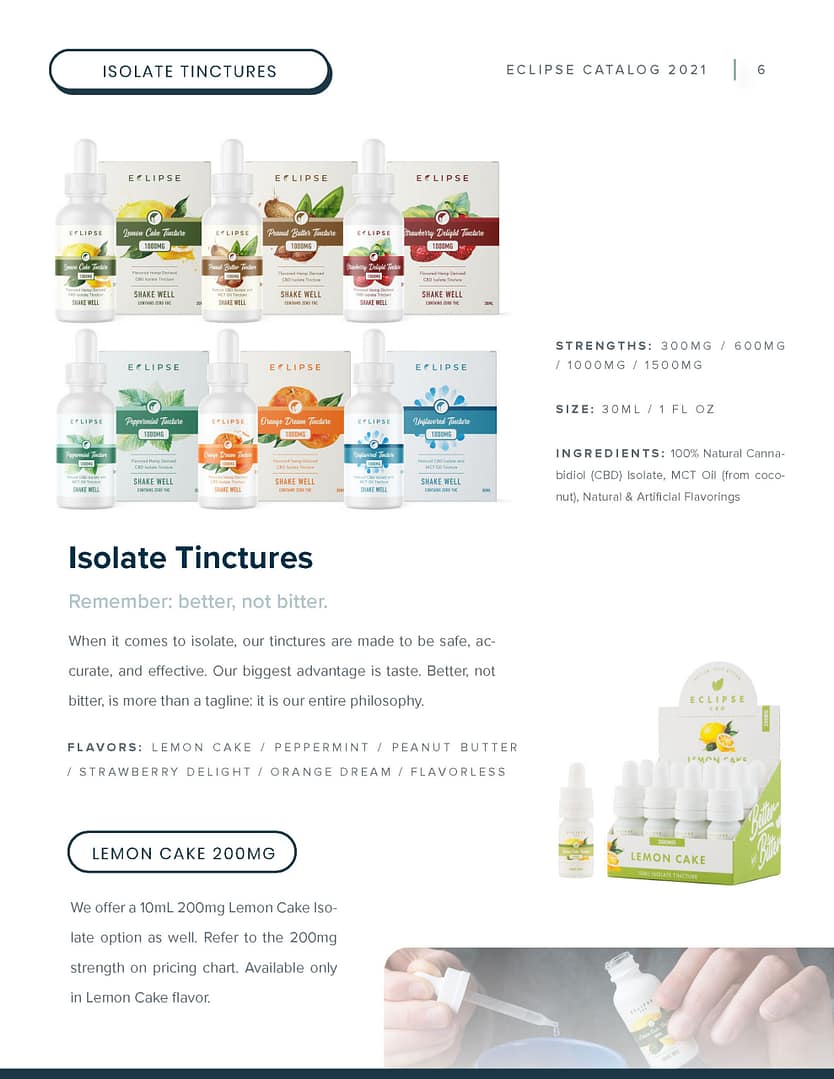
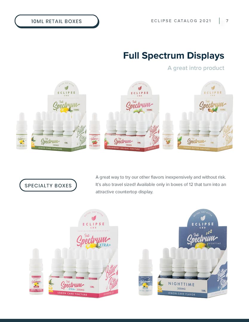
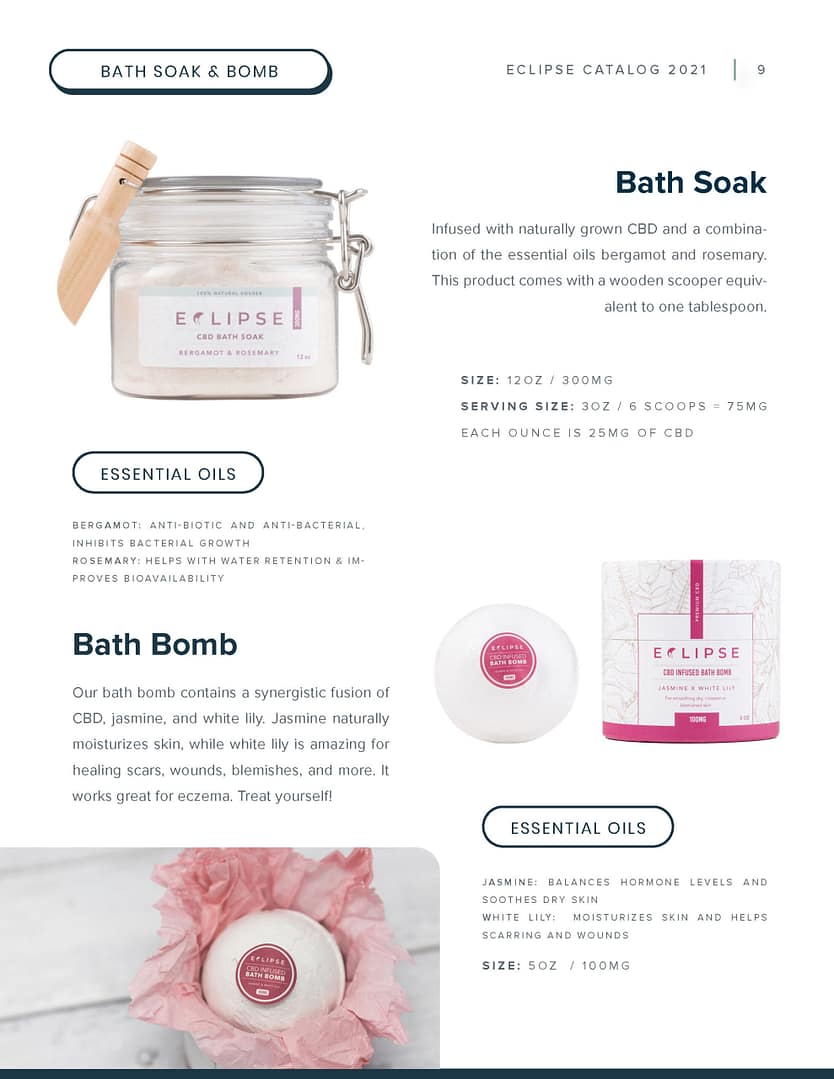
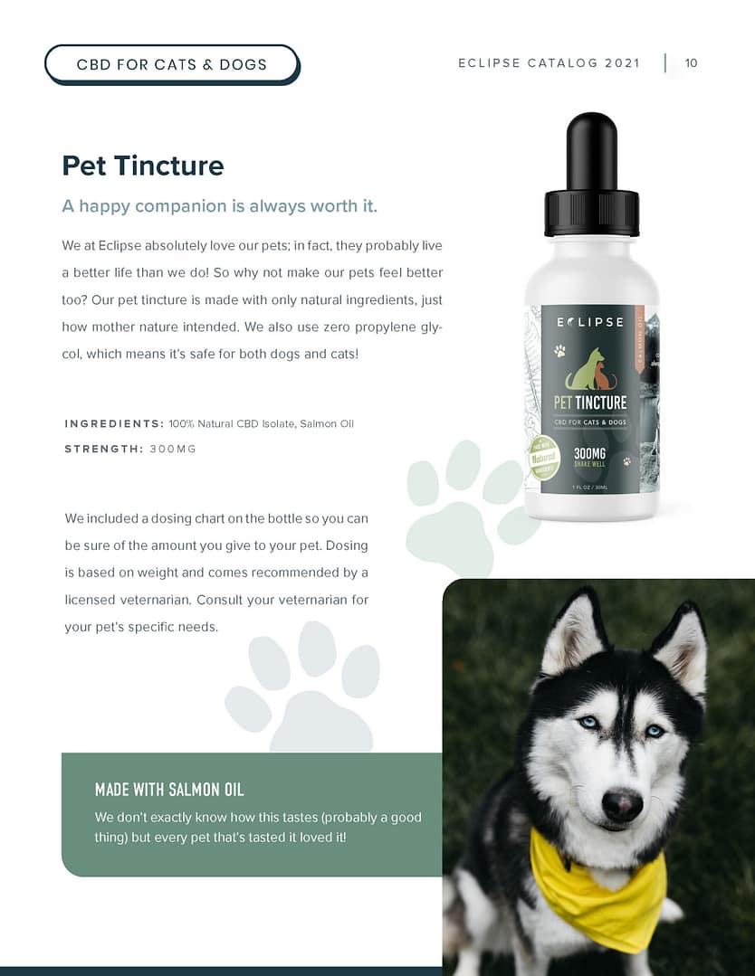
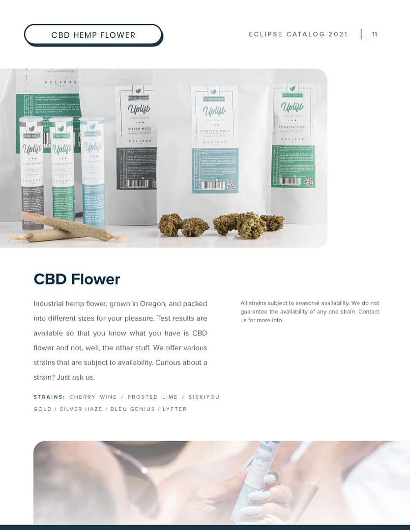
I later returned to further develop and enhance the Eclipse brand. I consolidated previous research about our customers and industry trends and utilized those ideas in our visual styles, imagery, verbiage, tone, slogans, and more. Eclipse was a brand with a living, adaptive framework as its core support.
Over the course of a year, Eclipse’s stylistic evolution became more consistent, defined, and confident. Our goal was to cultivate trust via a cohesive and scalable visual style that made the company appear far larger than it was. This growth included a brand glossary with visual aid icons that matched industry terminology, which allowed us to turn keywords into multi-purpose visual assets. It also gave Eclipse even more credibility and authority.
Initial color palette
Soft tonal earth colors paired with dark blue grey for type and white as a backdrop
Palette in context
Earth toned colors helped us establish trust and brand ourselves as an alternative holistic solution
Current palette
The new palette provides us with more customization and flexibility. It also adds designated accent colors and a soft complementary to our darkest color.
Palette in context
A bolder use of blues and aquas facilitates a stronger association to the familiarity of health and wellness platforms, adding a subtle appeal to authority.
First logo
The very first iteration.
Second (alt) logo
This one was made for letterheads, but we never used it in practice.
Final logo
I fused our wordmark with our icon.
Version 1
A leaf to convey the holistic aspect of Eclipse
Version 2
The leaf in a circle, representing an eclipse
Version 3
A filled icon went better with a filled logo
Final icon
Made to look like the letter ‘C’ and an eclipse
Better not bitter
Our slogan, in horizontal script.
Better not bitter - refresh
Rearranging the script made it more deliberate and usable in layouts
FinalizationCompletion...for now
A new Eclipse
With the initial design phase finished, I further refined and defined our brand visuals. As mentioned earlier, our goal was to cultivate trust via a cohesive and scalable visual style that made the company look far larger than it truly was. This included a brand glossary that closely matched industry terminology, turning keywords into visual assets.
Color Scheme
The final palette combines Eclipse’s holistic nature with a clean and sterile medical likeness. The complementary navy and baby blues emulate big healthcare company websites and brands, while the aqua accents represent a combination of blue-green flora hues and the water surrounding them. Water is the element of life (technically, it’s carbon, but let’s pretend) and I incorporated this symbolism to visually support Eclipse quality of life value propositions.
#FFFFFF
#032F45
#DBF0FF
#7EC6C0
#259E93
#5D6871
Typography
We almost chose a slab serif typeface for body copy, but decided that our audience would have an easier time reading something plain and straightforward. Choosing a typeface among thousands of sans serifs led to chaotic indecision and back and forth, but in the end, we decided that for web (Adobe integration reasons) our body copy would be Work Sans. In all other use cases, we use Proxima Nova for both headings and body text.
Aa
Poppins Bold 48pt
Poppins Bold 27pt
Poppins Bold 25pt
Barlow Bold 14pt
Work Sans Regular 16pt
We almost chose a slab serif typeface for body copy, but decided that our audience would have an easier time reading something plain and straightforward. Choosing a typeface among thousands of sans serifs led to chaotic indecision and back and forth, but in the end, we decided that for web (Adobe integration reasons) our body copy would be Work Sans. In all other use cases, we use Proxima Nova for both headings and body text.
Icons + Industry Language
Federal laws have strict standards on the language CBD companies can use, so the industry made its own holistic care lingo. I created line icons to visually supplement these terms; replacing terms outright would not have worked because the jargon isn’t well-known outside of the industry. A visual aid adds visual context for better understanding.
Imagery + Atmosphere
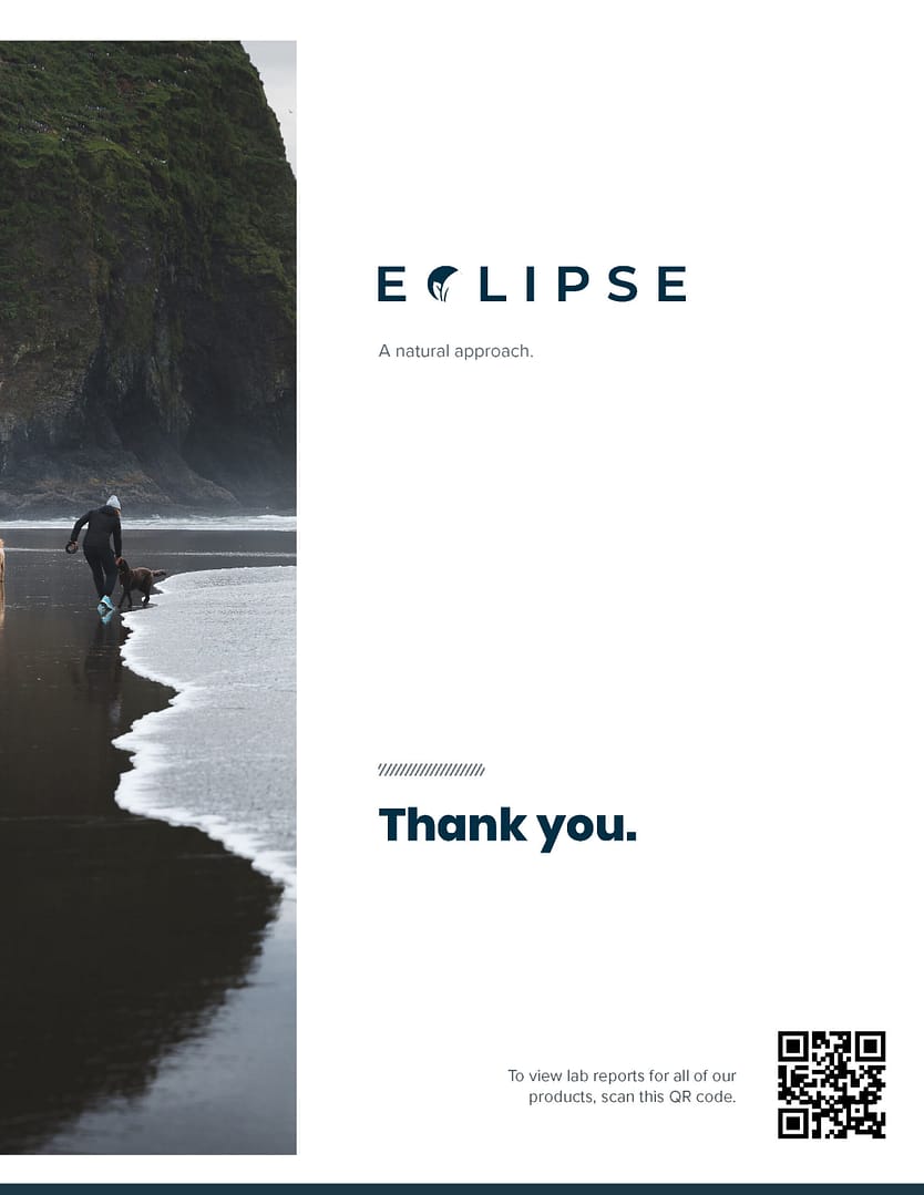
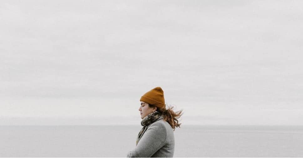
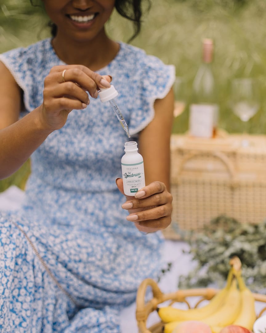
Our imagery was made to be calming and beautiful to appreciate everyday life and tie Eclipse to those feelings. I used navy blue, aqua, light aqua, light blue, blue gray, and white throughout the site design because they are easy on the eyes while still being professional enough for a business like ours. An overwhelming amount of health-associated platforms and websites use a variant of blue.


Project debrief
In the end, I believe Eclipse became everything it was intended to be. It is professional, with value propositions at the forefront of its identity. There are several things I would change about the entire process, namely getting more time to build a base framework and having a full team to constantly bounce ideas around.

