Product Design
Discord
I worked on this as a theoretical project and for Discord application. I focused on the Inbox component and its evolving use cases. I am not affiliated with Discord in any way.

Introduction
As an avid Discord user of six years, I’ve noticed the inbox isn’t utilized as much as it could be. I surveyed other users and scoured social forums for feedback. As Discord and its communities grow, it’s vital to keep platform information organized and purposeful. I decided to rethink the inbox entirely, from its placement, to its functionality and use cases.
Objective
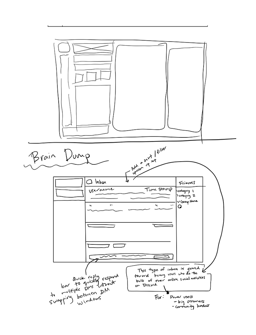
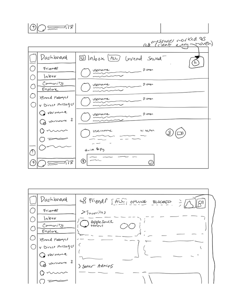
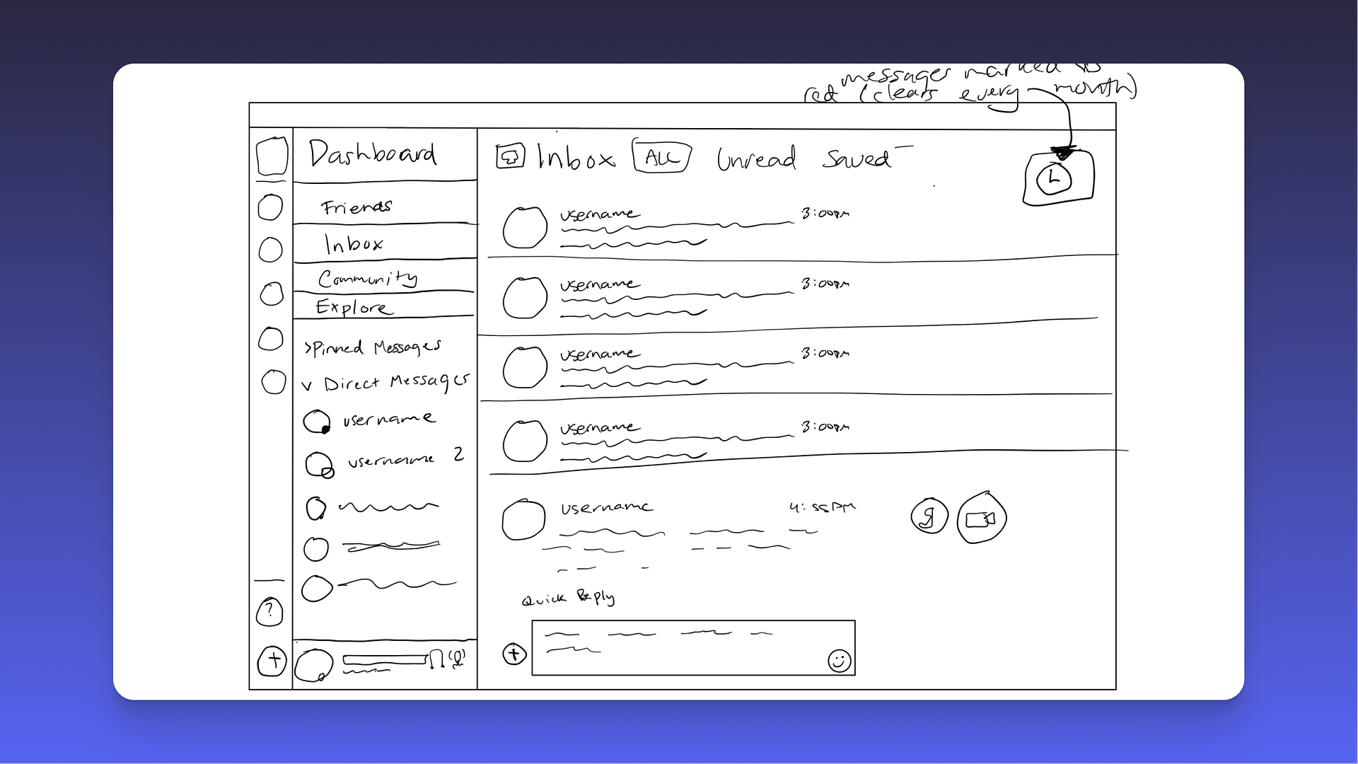
My goal is to optimize the inbox and turn it into a must-use feature for Discord power users, such as community admins and streamers. The inbox would bridge the gap between sought out users and their respective community members. Instead of replying one by one to conversations using the left sidebar, users would now be able to quickly see the context of their last message and send a response without ever leaving the inbox window. The user would be able to toggle the ‘Quick Reply’ feature by simply clicking on the message, which triggers an animation of the message expanding into a text field.
Problems
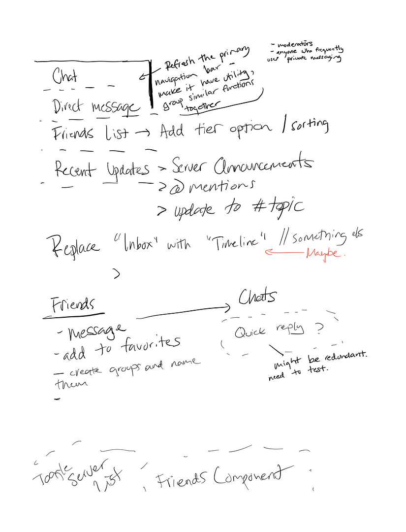
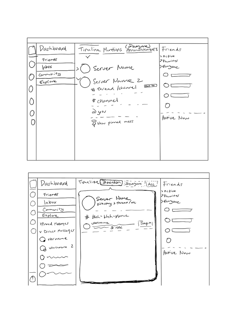
Power users frequently have flooded DMs, which can clog up the server sidebar and make for a visually overwhelming experience. Rather than flooding an already overcrowded component with more information, I instead present an alternative: separating server alerts from direct messages into an inbox and a timeline.
The current inbox is tucked away on the top right. This placement works if the feature stays as it is now, but I find the feature as-is can no longer keep up with current community growth. When I asked users to describe their experience using the Inbox, I found common frustrations:
It's overwhelming
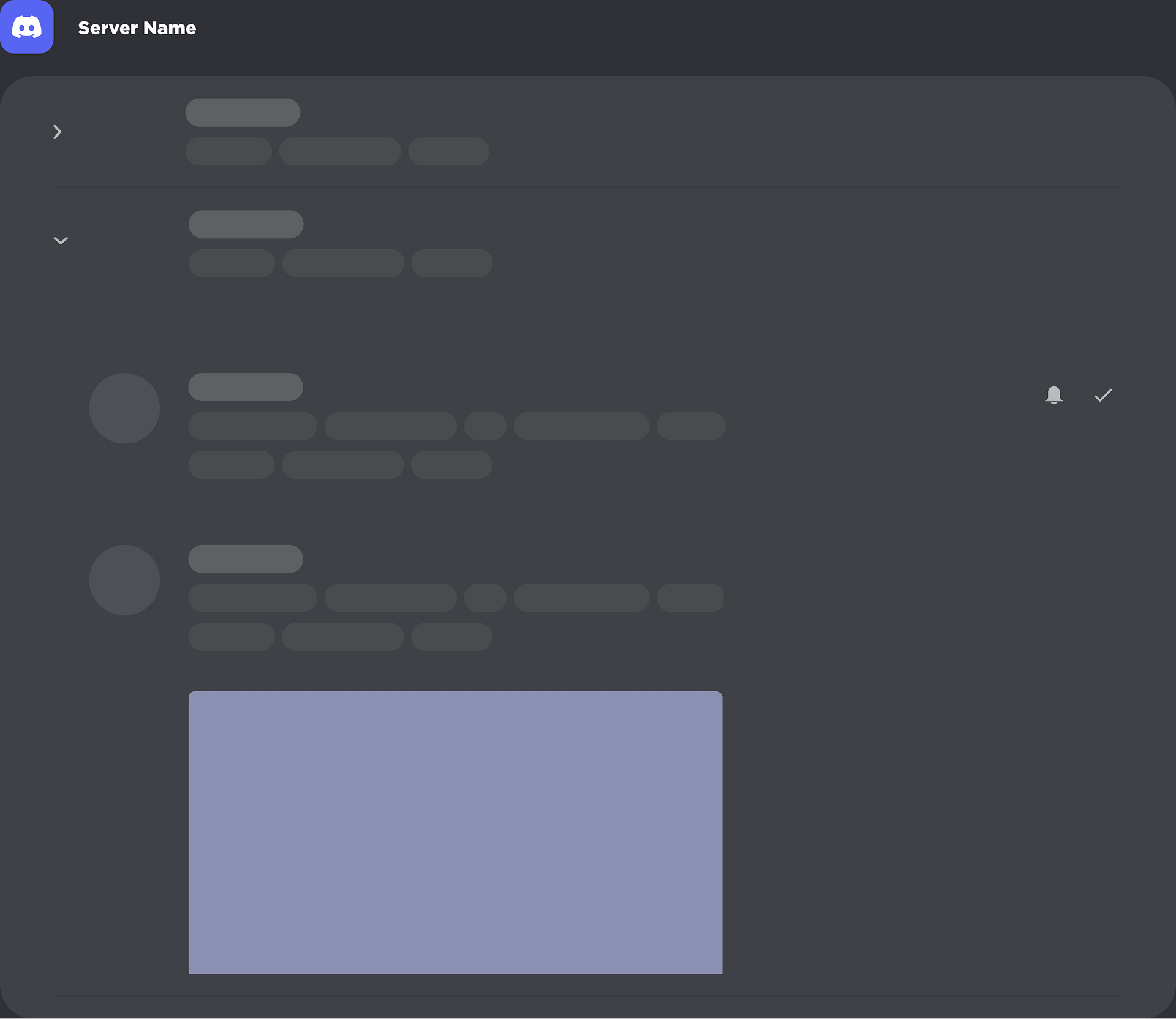
The current inbox floods you with isolated strands of information with no grouping or notable hierarchy. Server notifications are individual and each channel gets its own bounding box even if two announcements are from the same server.
It fatigues users
Having so many notifications to sort through disincentivizes users from checking their announcements and other community news. Having only ‘Mentions’ vs. ‘Unreads’, it’s no surprise the user goes through decision paralysis: there’s too much information, and none of it is grouped. It’s a free-for-all stream of notifications.
Odd placement
Many platforms place their help indicators at the edges or bottoms of their product: it’s a very much, “here it is if you need it, but if you don’t, pay it no mind,” component. Placing the inbox next to it creates an implicit association that you don’t really need this feature, but it’s here for when you do. Discord Communities are only growing, and with that, so are one on one interactions.
Design Process
Each step in my process has subtasks. Breaking it down this way allows me to revisit a specific step in my process, instead of scrambling to find where I pivoted ideas.
If I had to name my four steps, they would be The Brain Dump, Scribble Your Heart Out, Get Feedback, and Do the Work. The first three steps loop several times before I move on to crafting functional prototypes.
The Brain Dump
I review, and then jot down pros, cons, neutrals, user pain points, friction points, and hypothetical solutions.
Draft Plans
I audit hypothetical solutions based on feasibility and importance. Then, I draw wireframes and sketches.
Get Feedback
I present my sketches to other users and non-users. Non-users offer fresh perspectives and suggestions.
Do the Work!
High-fidelity mockups and prototypes galore. Even if I’m satisfied, it’s back to the lab for round two, three, four…
The Brain DumpTranslating Thought
Such Scribble,
Many Wow
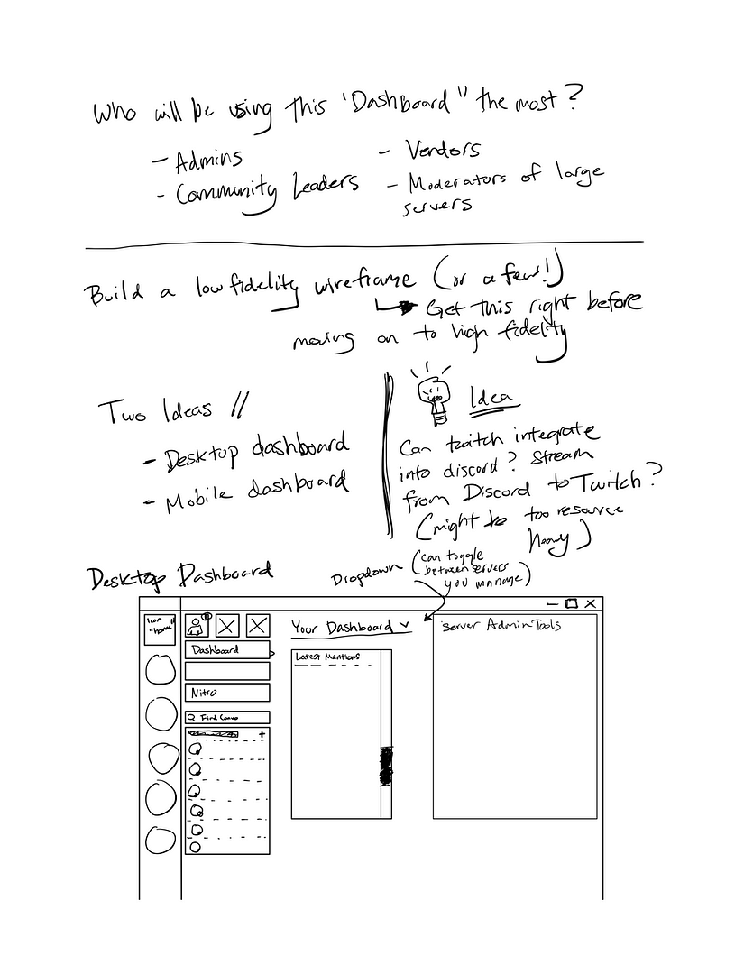
I sketch concepts to make directional sense of whatever my brain spits out. Outlining, wireframing, and sketching are crucial steps in my process: I can’t work without tactile feedback.
It is a great progress marker: even if I’m scribbling a word I don’t know what to do with yet, I’m reassured that I’ll always have ideas to revisit.
Once I have the initial scribbles out of the way, I’m free to chisel away at the excess, and simplify, simplify, simplify.
Draft PlansApplying User Needs
Wireframing
My initial idea for the inbox looked a lot like Apple’s current iMessage ecosystem, minus the chat bubbles and color. Discord, however, takes structure and inspiration from IRC, and I wanted to keep this feeling intact. Instead, what I came up with was a way to quickly view a snippet of the last conversation, and, if you choose, to click and reply. I consolidated the experience of replying to multiple users in quick succession into one tab with contextual interactions.
Get FeedbackKnow thy User
What do
People Feel?
When I create my question sets, I do my best to keep my own bias out of the equation. Some questions are more objective than others: this is, after all, about user perception. I start off asking things like, “What is the first thing here that stands out to you?” to get a sense of what this user prioritizes — what characteristics (color, shape, text, etc.) does this person gravitate toward? If someone focuses more on color, while the next person focuses on an animated component, then perhaps there’s a way to combine these characteristics to draw the user to our target spot.
I treat the answers as starting points for mind maps and brainstorming further, and then proceed to standardize questions. I’ll meticulously comb social media threads to gauge public sentiment — does this issue pop up frequently? How frequently? Do the issues seem to impact a particular user group? Subjectively and statistically comparing groups of data could yield intersectional solutions that would’ve taken longer to find. The great thing is social media provides several metrics you can compare: the likes, hearts, and other concurrency tokens.
Do the WorkDesign as a Function
The New Inbox
My new Inbox component (named inboxMessage in Figma) primarily serves power users whom socialize frequently or lead communities. This group receives many Direct Messages (DMs), which clogs up the serverSidebar and makes for visual clutter. Rather than flooding an already overcrowded component with more information, I broke the inbox down into simple functions, taking inspiration from familiar ideas while staying true to the Discord look and feel.
New sorting filters
A familiar interface
New QuickReply feature
Prototyping
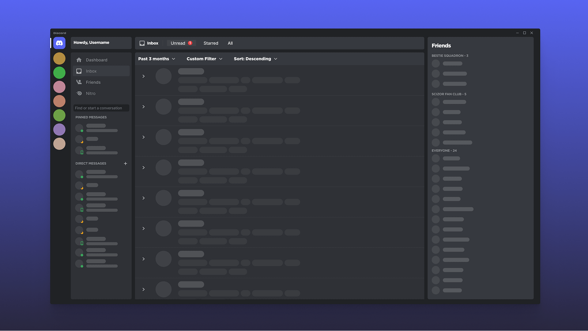
The video below shows the prototype for my concept. The custom filters are still in the works. I made several UI changes, including adding an “Inbox” tab to the left. You will also notice a “Dashboard” tab, which is another new feature I’m experimenting with.
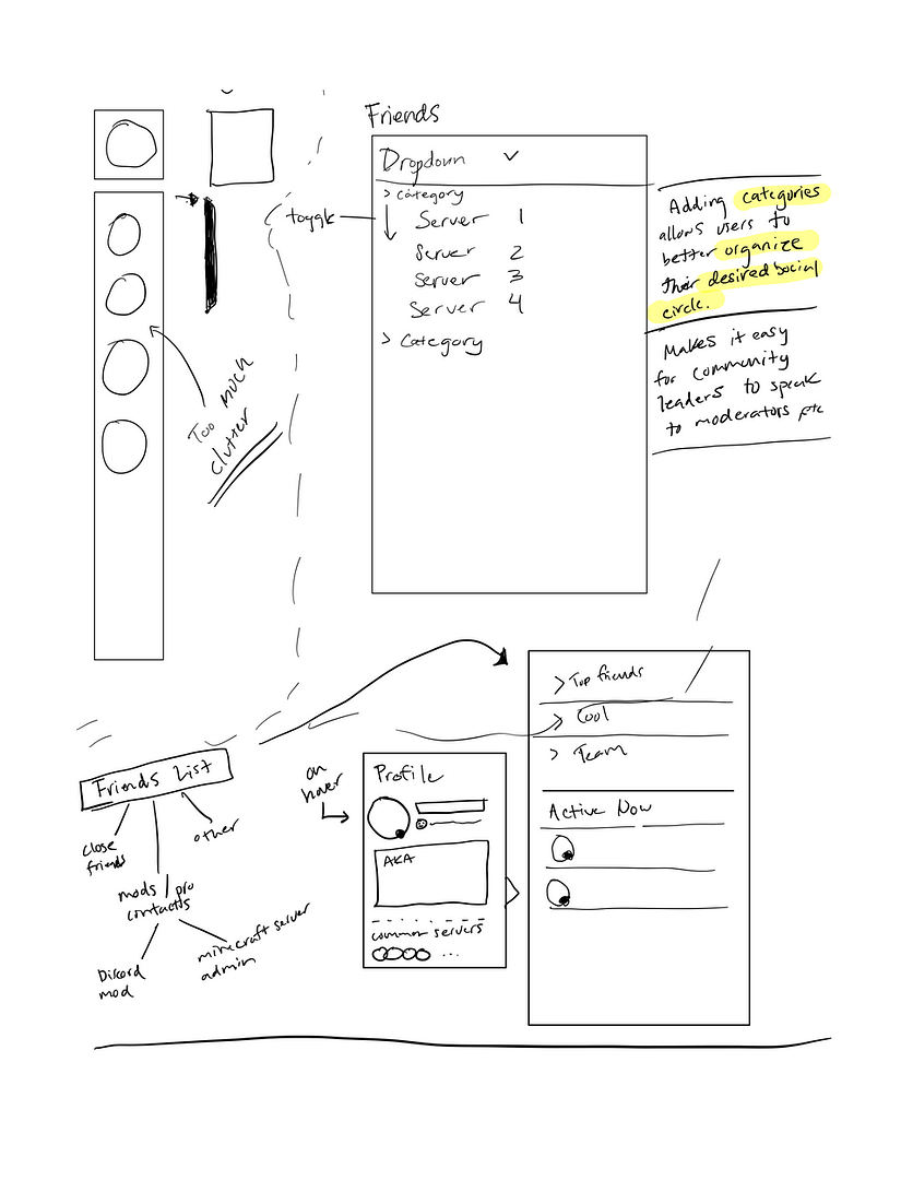
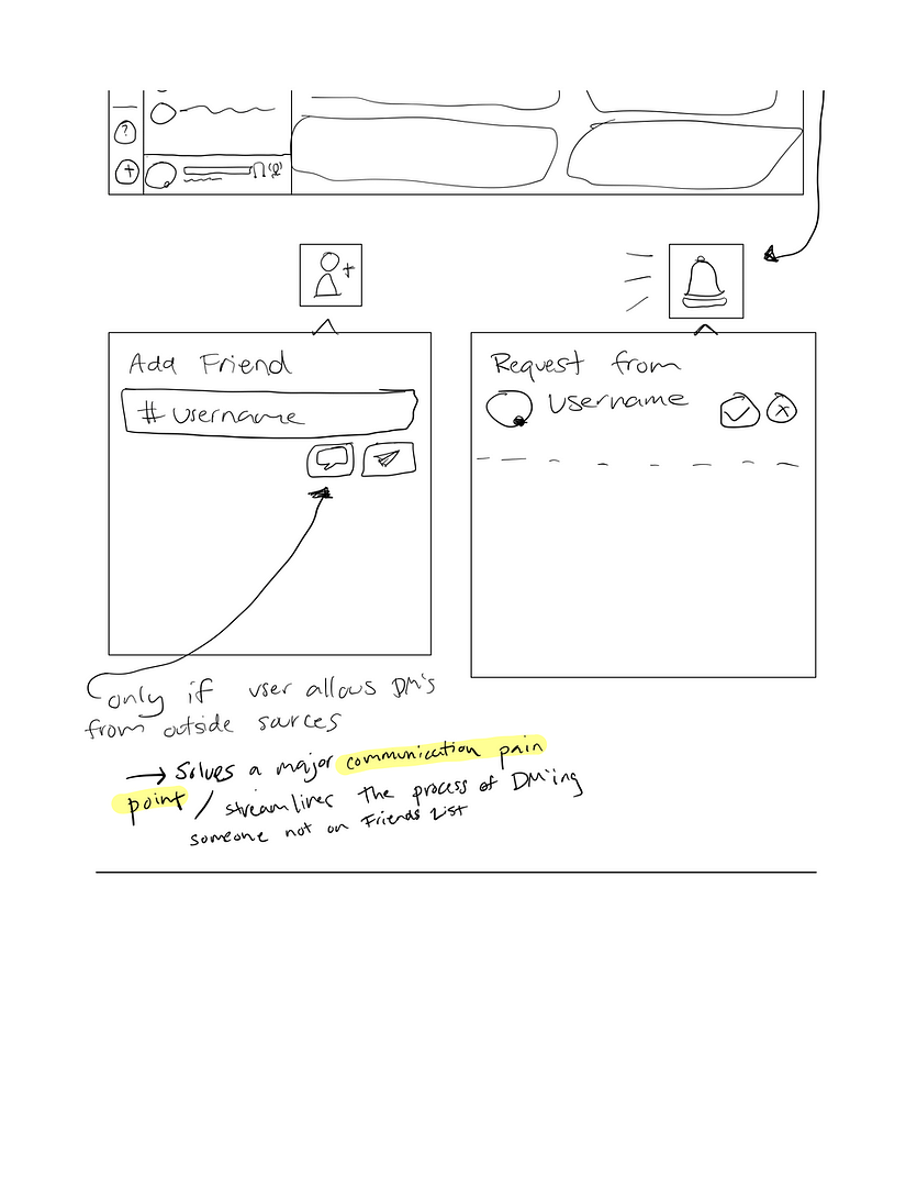
The “Friends” list on the right hand side has added categories: I frequently see users requesting for a way to name friend categories. Adding this feature takes away the hassle of having to go into your friends list and manually type in a user name.
The “Find or start a conversation” search bar is now located just above the direct messages and below the main menu tabs. Direct messages now have two separate groups: users can now pin their favorite conversations.
Though there is a Direct Message section on the left, the new inbox is for quickly replying to many messages in one dedicated time block. It can organize your messages, and to reply, all the user would do is hover, click, reply in the quick reply box that appears, and hit enter. As stated earlier, this is useful for those that have many messages to reply to on a constant basis. In addition, users will see snippets of context without needing to expand the message, much like other familiar messaging platforms.

